How do you track your KPIs with Power BI?
A KPI (Key Performance Indicator) is a quantitative metric used to evaluate the achievement of a goal. Some KPIs are generic (e.g., revenue, net income, sales volume), while others are specific to the company’s activity (e.g., internal rate of return (IRR), cash-on-cash (CoC) in the real estate sector).
In dashboards, KPIs are often presented in a way that allows comparisons i) to a reference scenario (e.g., previous year, budget) and ii) to another department or business unit. This comparative reading helps define the actions to implement in order to achieve the set objectives.
KPIs are now ubiquitous in companies and are an integral part of strategic management. As such, they must be regularly accessible—individually or during team meetings—and shared with stakeholders. Power BI is a suitable solution for tracking KPIs because it allows easy visualization and efficient information sharing.
This article presents common mistakes to avoid and best practices to follow when creating your KPIs on Power BI. It does not address how to define a relevant KPI, but rather explains how Power BI can help you track them more effectively.
Mistakes to Avoid When Tracking KPIs in Power BI
When presenting KPIs in Power BI, a few elements must be considered:
- Avoid having too many KPIs: it’s better to have a limited number of well-defined, clear, and impactful KPIs than an overwhelming list that may confuse viewers.
- Avoid clutter: the visual appearance of KPIs is crucial. Key information should not get lost in a flood of secondary data.
- For example, it’s not necessary to show the evolution of a variable over the last three fiscal years. It’s more relevant to choose the most meaningful reference year to compare current values against.
- Choose an appropriate visual: since KPIs can vary in nature (percentage change, progress rate, value, etc.), the selected visuals should highlight each KPI’s uniqueness. You can find a catalog of available visuals sorted by data type here: https://www.sqlbi.com/ref/power-bi-visuals-reference/.
- For instance, a gauge is ideal for showing progress toward a goal, while a card visual is more suitable for presenting a value (e.g., revenue or sales volume).
Best Practices for Tracking KPIs in Power BI
Once you’ve defined the KPI and chosen the appropriate visual—while avoiding common pitfalls—here are some best practices to make KPI reviews in Power BI as effective as possible:
- Highlight the message: KPIs are often the first figures the user sees. The message must be crystal clear. To achieve this, consider:
- Using color symbolism: red for objectives below 50%, orange below 75%, and green otherwise
- Highlighting trends by adding “+” or “–” signs to indicate change (in % or absolute value)
- Cleaning up the visual: remove unnecessary legends (the visual should be self-explanatory), overly long titles, and superfluous data labels
- Structure the pages: KPIs should appear on multiple pages, each serving a different purpose. A typical report structure includes:
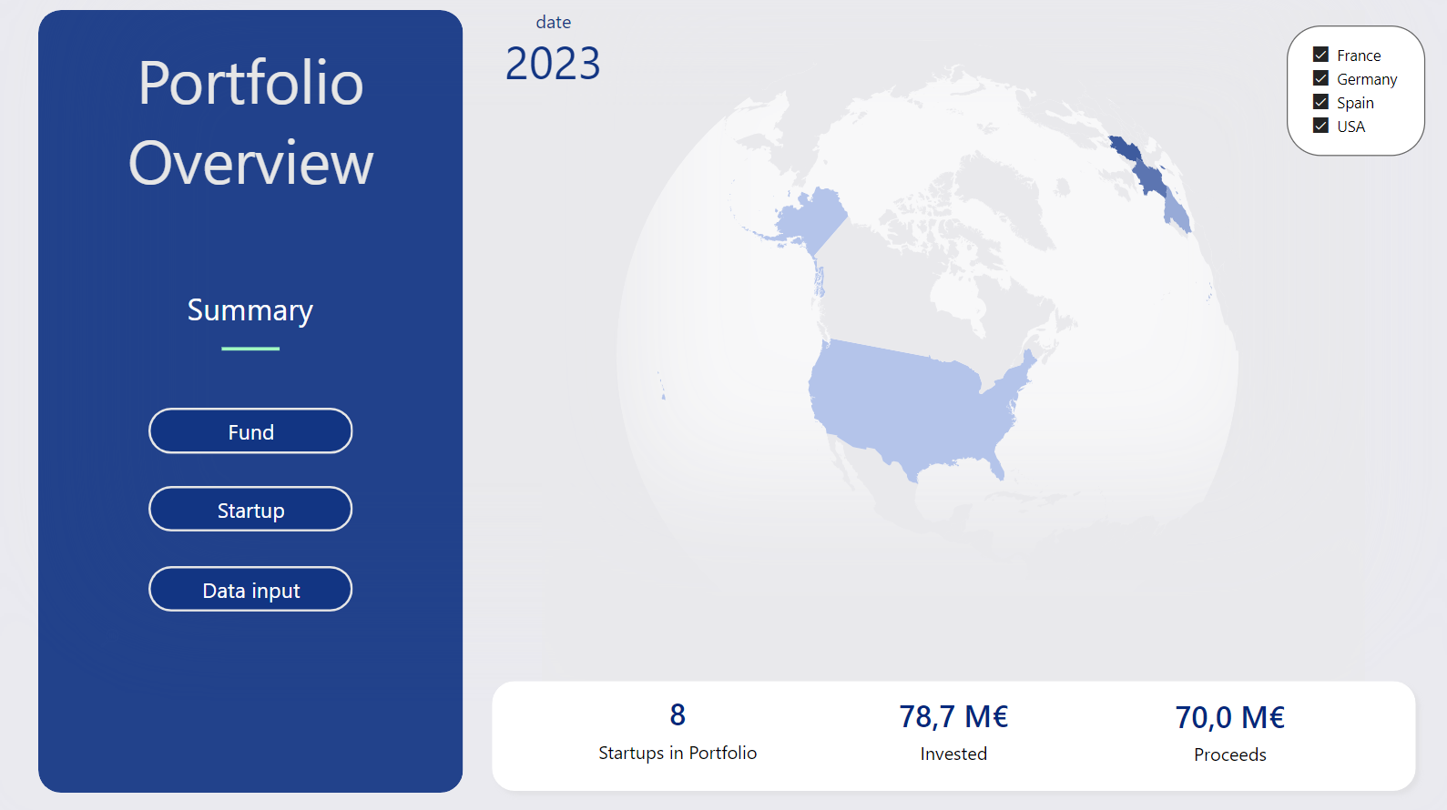
- A dedicated KPI page (Overview/Data Summary): This page isn’t meant for deep analysis. Instead, it provides a high-level snapshot of business performance through KPIs. It’s often the entry point into the report, with navigational links to detailed pages. Filters can also be added to refine KPI results by analytical axes (e.g., geography, brand, product category).
- KPI reminders on detail pages: This helps users retain a macro-level context while reviewing detailed analyses. These reminders should be positioned at the top of the page (detail increases as you scroll). Detailed visuals should then break down the KPIs across analytical dimensions or provide complementary measures.
Conclusion
Power BI is likely the best-suited solution for tracking KPIs. It enables powerful and elegant visualizations of your metrics and allows users to interact with the available data. KPIs are accessible across devices and are regularly updated. As such, they serve as a motivational tool for those who consult them.