
How to easily build a P&L in Power BI at no extra cost
Why financial statements are hard to build in Power BI?
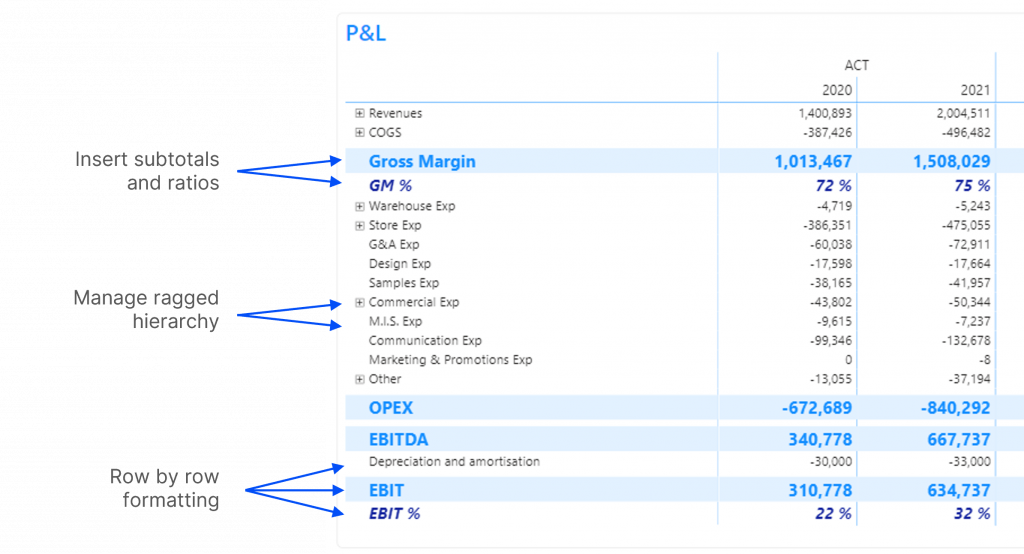
Power BI is an amazing tool to shape and visualise data. While it’s easy to create histograms and maps, presenting sleek financial statements isn’t so simple. At F31, we had the chance to help various finance professionals to build their P&L in Power BI. We were often frustrated by the lack of flexibility and we guess we are not alone! Adding new rows for cumulative subtotals and ratios, managing ragged hierarchy and formatting are real challenges, even for DAX champions.
In this tutorial, we will share our favourite method to build a P&L in Power BI. No complex DAX or paid-for custom visual is needed, we will use Profit Base custom visual free features only.
Options to build a P&L in Power BI
There are different options to build a P&L in Power BI – some more complicated than others. F31 consultants had a chance to try two of the most popular techniques: advanced DAX patterns combined with native Power BI matrix, and custom visuals. Here’s what we found out:
DAX and native matrix
It’s a highly customisable solution, but it requires very good DAX knowledge and the maintenance can be tedious. We will soon write a step-by-step blog article for you to try!
Custom visuals
There are numbers of custom visuals designed to help finance pros present their numbers in Power BI (Inforiver, Acterys, Profit Base, Power On, etc.). These low-code solutions are very accessible but often require a paid license. Profit Base is one of our favourites as it allows us to design a very satisfying solution at no extra cost.
Structure your data model
Before you even think of building your P&L, you must think about having an adequate data model. It ensures easy DAX and fast reporting so it’s worth spending energy on it.
To get started, you need to have these three following tables in place:
- General ledger (GL) → your fact table
- Calendar dimension → to slice your data by time
- P&L structure dimension → to shape your P&L layout
Here is what our data model looks like:
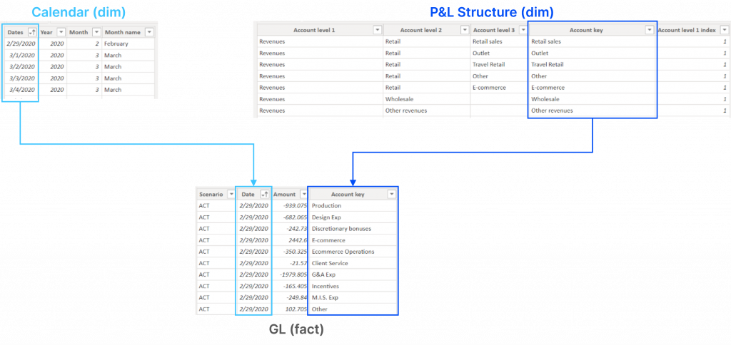
General ledger
The GL we use contains a Scenario column (actuals, budget, LE1). It is not mandatory.
Calendar
The Calendar table is classic in a Power BI model. See this tutorial for more details.
P&L structure
It contains:
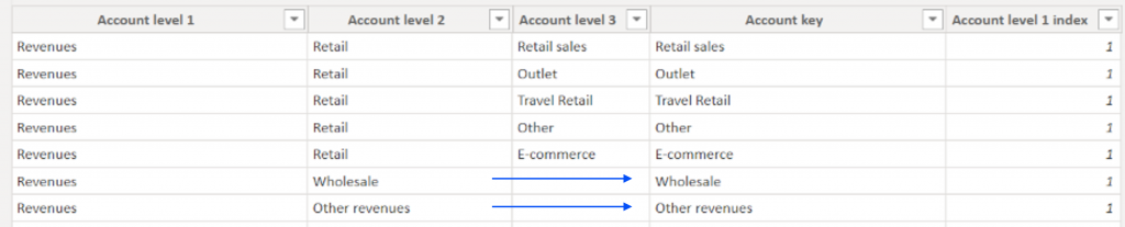
- Account Levels 1, 2 and 3: There are groups of accounts shaping your P&L. You can have more or fewer levels, but we recommend having no more than 4 because managing the hierarchy will be time-consuming with more. Not all of your accounts need to have the same depth. Some levels can be left empty.
- Account key column: This column will be the one-side of the relationship with the GL table. It refers to the smallest level of hierarchy for each account. Therefore this column cannot contain any blank value.
- An index column for Account Level 1: It is necessary to sort the labels and display them in a custom order rather than alphabetically.
There are no cumulative totals or ratios in this table at this stage (gross margin, GM%, OPEX, EBIT, etc.). We will add them with the Profit Base custom visual.
Here is an example for the Revenues:
Build your P&L step-by-step
Now that you have your structure in place, it’s time to start building your P&L.
Data model
- Import the three tables and create relationships
- Sort your Account Level 1 column by Account level 1 index column
- Create 1 measure → TotalAmount = SUM(GL[Amount])
P&L layout
- Add Profit Base custom visual
- Create a Profit Base matrix and add:
- Account levels in the Row Headers section
- Year and Scenario in the Column Headers section
- TotalAmount measure in the Values section
P&L formatting
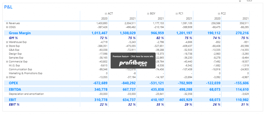
When it comes to formatting, you’ll want your P&L to be in line with your company’s brand guidelines and style. In the example below, we’ve used F31’s preferred colour, but you can adapt this based on your needs
Please keep in mind that some Profit Base options require additional payments. You will see a stamp in the middle of your matrix if you use one (eg. Column expansion).
To start formatting your P&L, you’ll need to follow the steps we’ve listed below.
Define custom styles
We like to start by defining our styles before adding subtotals and ratios to the matrix. You can always edit your styles once you have added your subtotals and ratios, we recommend trying and adjusting once the layout is finalised.
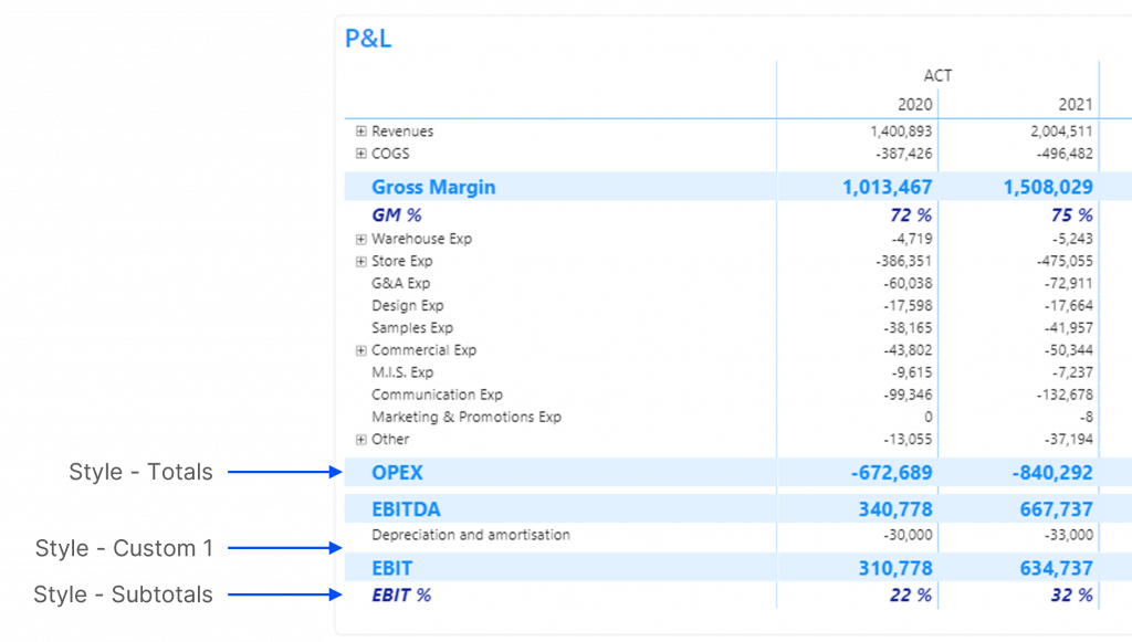
At the bottom of the ‘Format your visual’ tab, in the Visualization pane, you will find various styles. We suggest defining three of them:
- Style – Total → to format Gross Margin, OPEX, EBIT, EBITDA
- Style – Subtotal → to format Gross Margin % and EBIT %
- Style – Custom 1 → to add blank rows where relevant, reduce font size to 1 pt
Edit Profit Base visual properties in the Visualisation pane
- Grid: enable vertical grid and choose a light colour
- Column styles: increase column width
Customise Profit Base visual in the Profit Base Editor
Find the Edit button by clicking on the ellipsis (…) in the top right corner of the visual.
- Add cumulative subtotals:
- Right-click on COGS and select ‘Add row after’
- Title: type ‘Gross Margin’
- Formula: click on row headers to sum COGS and Revenues
- Style: select Total
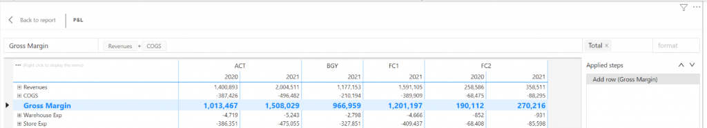
- Reproduce the same steps for OPEX, EBITDA and EBIT
- Reproduce the same steps for Gross Margin % and EBIT %, changing Format to % and Style to Subtotals
- Manage row expansion. You can remove the + icon when unnecessary: right-click on the row header and select ‘Set allow expand’, untick the box ‘Allow expanding and collapsing this box’.
- This is it, you can go back to the report and enjoy your P&L 😎
On the right, you notice a Power Query-like Applied Steps pane. It’s very useful to delete, move or edit steps. Click on a step to open the formula bar and use the two arrows to move it up or down. Some steps depend on previous steps and cannot be moved. For example, you cannot place the EBIT step before the Gross Margin.
Limits of the solution
We love this solution because it’s accessible and doesn’t require any DAX skills. However, it has some limitations:
Lack of flexibility
Any change in your P&L structure will break your layout (new account or different sorting for example). Cumulative totals and ratios will appear in the wrong order and will need to be deleted and created again.
Lack of scalability
You may have noticed how long it takes to manage row expansion account by account. Unfortunately, there is no way to set up multiple rows at once, so this solution is not recommended for a complex P&L structure.
Lack of trust in custom visuals
You or your team may be unwilling to use custom visuals. We often hear that they are not reliable or inefficient. These worries are valid and certainly apply to some custom visuals. However, we think Profit Base is safe enough to be used in production. It’s Power BI certified (blue badge), and the risks of it being removed from the store or drastically changed are low (especially because they have clients paying for the premium features). Performance-wise, as with every visual in Power BI, the better your model the quicker your matrix will load. From our experience, a clean P&L available in Power BI brings already so much value to users that they are willing to wait for a few seconds to get their data.
Thank you
Thank you for reading our article. We hope it helped! Follow us on Linkedin to stay up-to-date with our latest articles.

